 VfL Bochum Hub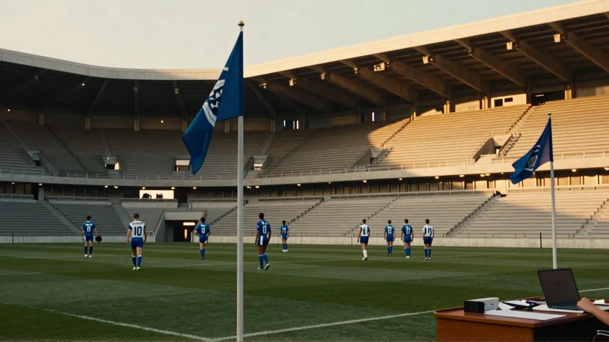
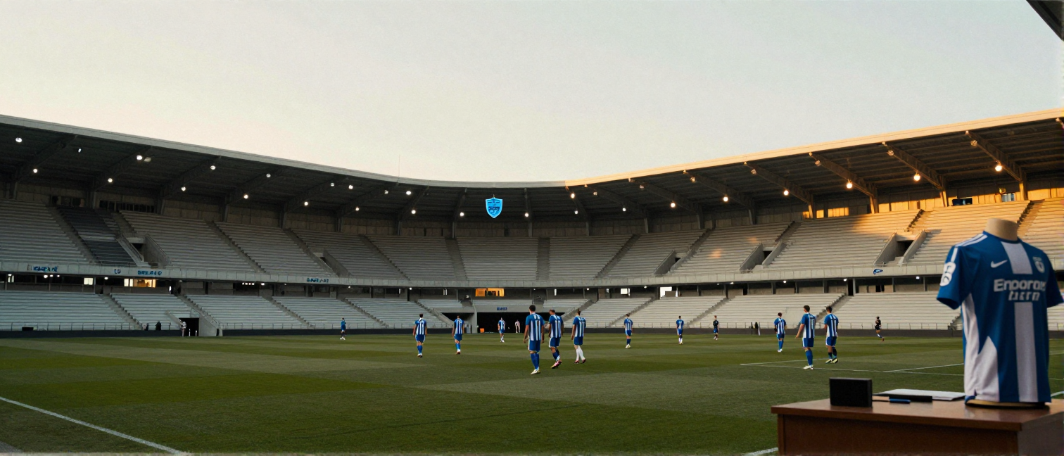
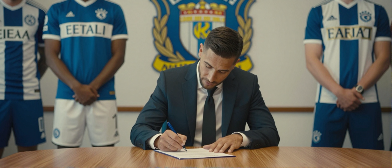
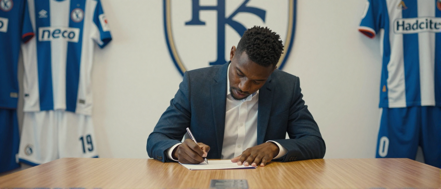
VfL Bochum celebrates the history of its home kits since the 1990s
The current season has VfL Bochum sitting 9th in the 2. Bundesliga with 44 points (11W‑11D‑12L) and a recent three‑match winning streak. While the team under manager Thomas Reis pushes forward, the new photo collection recalls the kit evolution that has shaped club identity since the early ’90s.
Which designs defined the 90s?
In the early 1990s Bochum wore a simple dark‑blue shirt with a white collar – a look that echoed the 1994 promotion. The kit was produced by local brand Jako and stayed unchanged until 1999, even as the club bounced between the 2. Bundesliga and the Bundesliga.
How did the design evolve in the new millennium?
From 2000 the club switched to a lighter blue with broad white stripes, instantly eye‑catching. 2005 saw a bold move: dark navy combined with orange accents, dividing fans but drawing attention to the club. In 2012 a minimalist design returned, focusing on the club crest.
What do fans think today?
Today's fan generation debates actively on social media. Many praise the retro 1994 design, while others celebrate the sleek 2023 version with its slim cut. Comments often link shirt colour to playing style – dark blue for defensive solidity, light blue for attacking flair.
Why are the kits more than just clothing?
Each home kit mirrors a chapter of the club’s story: promotion, relegation, comeback. The current shirt, in use since 2024, bears the motto “Strength from Tradition” and recalls the latest win over Karlsruher SC (1‑2, 2026‑05‑17). This year’s numbers – 49 goals scored, 47 conceded – show an attacking approach, while the design emotionally binds supporters.
What does this mean for the future?
With a recent form of WWWDD and a 26‑point gap to league leaders FC Schalke 04, Bochum stays hungry. The kit remains a symbol of unity; next season could bring a new design visualising another promotion. As fans keep the discussion alive, the photo archive stays an anchor for club identity.